Reshape Health Grant Winner
Onboarding patients to a healthier nutrition
Take a deep dive into this grant project aimed to boost user engagement and encourage sustainable healthy eating habits at home.

The vision
Rewire Health's innovative app, Pursuit, is designed to cultivate the habit of preparing and enjoying healthy meals at home, providing users with personalized guidance and resources to support this vital daily practice.
By integrating culinary medicine with technology, Pursuit helps users seamlessly incorporate healthier eating habits into their lifestyles. This approach is key to Rewire Health's mission of using nutritional knowledge as a foundational tool for improving wellness and reducing health disparities across communities.
The Transformation
Here's what we accomplished:
Simplified the account setup and signup process, streamlining user entry while maintaining necessary information capture for personalized experiences.
Created a learn-by-doing tutorial that allows users to learn the app's features by using them, demonstrating immediate practical value.
Developed a well-organized welcome screen that presents a broad array of options clearly, allowing for effortless discovery and engagement with the app's content.
Leveraged co-creation, integrating diverse stakeholder insights to refine the app's design and functionality, which underscored the collaborative approach as a driver of innovation.
Healthcare
Design
Team
UX/UI Designer
Product Manager & Facilitator
Delivery
Key Insights
UX/UI design

It is all about creating the habit
From the very beginning of the discovery process, we understood that adopting healthy nutritional habits is much more than just providing recipes—it's about education and providing people with actionable, repeatable skills they can practice that lead to habit formation. The journey to habitual healthy home cooking begins with user engagement, which is significantly influenced by their initial interactions with the app. Therefore, the onboarding process is crucial. A well-crafted onboarding experience not only introduces users to essential features and functionalities of the Pursuit app but also motivates and empowers them to incorporate these tools into their daily routines. This is why we've positioned onboarding as our strategic focus, aiming to ensure it lays a strong foundation for long-lasting user engagement and effective habit formation.
With the goal of creating a minimal UI that focuses on key information (movement, status, measurements and instructions) the team introduced a set of directional arrows, concise one-word instructions and a strategic color scheme assuring a direct and clear interaction between the patient and the device.
The Onboarding
The Pursuit app already had a functional user onboarding process and a substantial user base. Based on valuable feedback from existing users and professional dietitians, we quickly identified specific opportunities for improvement, especially in the sign-up and setup phases. This allowed us to focus our efforts on enhancing these critical initial interactions:
The Signup
The initial onboarding screen, designed to expedite the process, required users to input their name, email, and password—entered twice for confirmation—along with an organization code. However, feedback indicated that users often struggled with the organization code, either forgetting what it was or misremembering the specific code provided by their physician. Our proposal: Split this into 2 parts:


By splitting the account creation flow into two distinct screens, the user's immediate focus is directed towards entering the organization code — a step we found to be challenging for some. This separation was strategically implemented after identifying that multiple users struggled with recalling or having the organization code on hand, an insight that surfaced repeatedly during our research interviews.
Initially, the Rewire Health team had reservations about incorporating social login due to privacy concerns and compatibility issues with iOS and Android stores. However, user validation sessions were key in shifting this perspective. These sessions demonstrated the clear advantages of social sign-up, boosting the team's confidence in this feature as a valuable addition to the app's onboarding process.

Account Setup
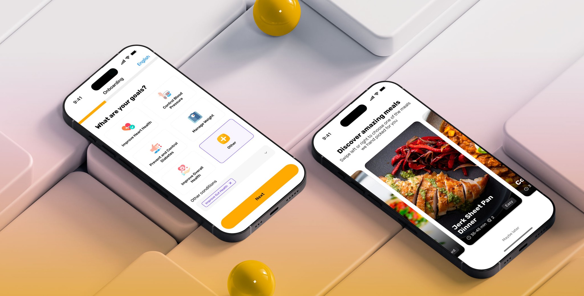
In order to provide the full value, a set of questions are required to setup the account for the specific user. This includes health risks, allergies and dietary restrictions.
We streamlined the process by requesting only the essential information upfront. By featuring the most common allergies (based on recent U.S. healthcare data) we reduced the need for excessive scrolling. Additional details were strategically deferred to subsequent stages, ensuring a concise and less cumbersome initial experience for the users.
Icons were incorporated into the visual design to quickly guide users, especially those with low literacy, non-English speakers, or visual impairments, to effortlessly navigate the app without relying solely on text.
Fun fact 😄
In our user testing, many mistook eggs for a dairy product. This common mix-up, we found, could be influenced by eggs typically being stocked alongside dairy items in grocery stores, subtly shaping perceptions that they belong to the same category.
Aha moment: Learn by doing.
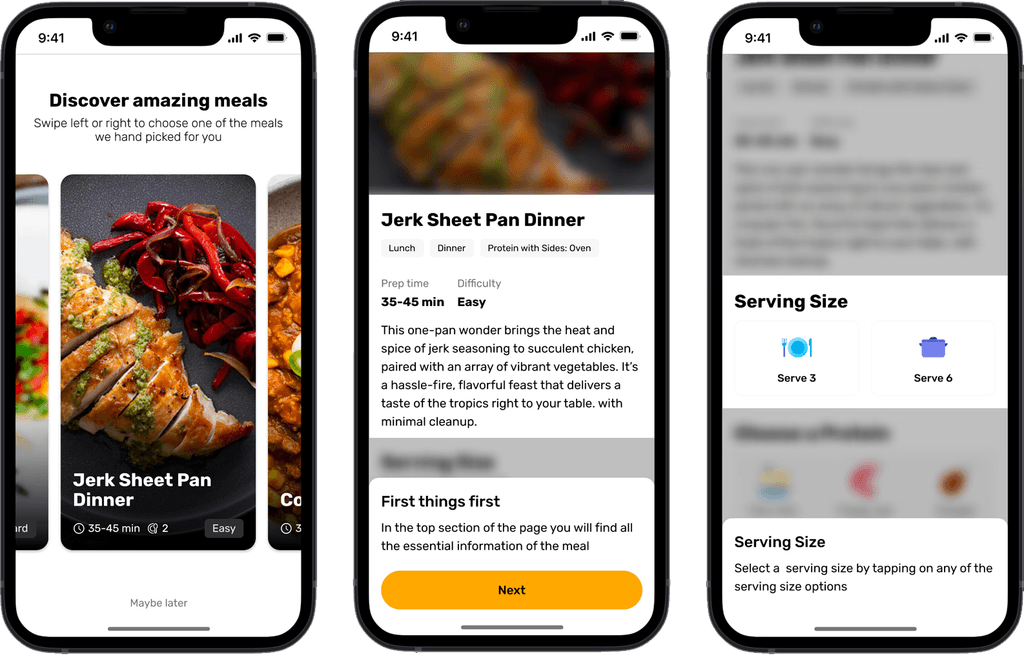
We have guided the user through the account creation, and asked the most relevant questions to customize the content. The challenge at this point was showing value right away, to keep the user enthusiastic and curious about what the app can offer. Why not show them how a meal is prepared?
Right away, a simple meal is presented highlighting the ingredients, serving sizes and appetizing full screen images. But this is not all, we made it mandatory to advance the tour by performing key actions to foster the feature discovery.
Ingredient swapping is a key feature that sets the Pursuit app apart from traditional meal preparation apps. Initially, this flexibility wasn’t obvious, leading to its underutilization. To improve this, we made it a central part of our interactive tutorial, allowing users to directly try out the ingredient swap feature. This hands-on approach not only makes the feature more visible but also helps users easily understand and use it effectively.
The challenge
Implementing the tutorial introduced a significant technical challenge: adapting the recipe demonstrations to match the diverse dietary preferences entered during setup. This complexity required more logic to ensure that a vegan user, for example, would see completely different recipe options than someone with diabetes and a dairy allergy. Investing in this tailored approach is crucial as it aligns with our value-first strategy, enhancing user satisfaction by personalizing the experience to meet individual dietary needs effectively.
Exploration
Show me the content
After the guided tutorial, the final step in the onboarding was to showcase the app's array of offerings. We aimed to introduce users to a diverse and customizable selection of recipes without causing overwhelm. The welcome screen does this adeptly by categorizing meals, such as sandwiches or types of meals, providing structured pathways that improve discoverability. This hierarchical presentation of options ensures that users can see the variety available and find different entry points into the meal selection process, aligning with their unique preferences and dietary requirements.
Testing gamification
In order to pursue engagement and habit creation, we also tested the idea of challenging the user with a weekly plan of 3 meals. The idea was to present the first meal tutorial as the first of a series of “onboarding” meals that you can make in the first week. The concept of gamification was also in the backlog of Rewire health, and this came up many times during the discovery


After testing this with users, we realized that this was too much information to start the journey. The main goal was to experience how the recipe works, and adding the extra effort to think ahead was another task and commitment that is more suitable once they start making the first recipe.
While the three-meals challenge gamification concept was ultimately not included in the final version, its exploration serves as a testament to the collaborative spirit of co-creation that the design sprint fostered with the grantee. This dynamic allowed for a creative exchange where previously considered ideas could be tested in a supportive environment, backed by a team ready to manage the logistics, from participant scheduling to session facilitation and documentation.
Transformation
takeaways
Throughout the ATDev project, our collaborative efforts helped to improve the Reflex User Experience, merging their cutting-edge technology with deep insights into rehabilitation needs.
By focusing on user-centric design, remote testing methodologies, and the integration of physiotherapist feedback, we've enhanced the device's functionality and accessibility.


